
Humma
My partnership capstone project with Humma, an emerging social platform committed to creating safe, culturally competent online spaces supported by an Empathetic AI™. Their strongest focus is on privacy, community, and inclusivity.
I participated in design and research throughout this project, leading our secondary research and refining a literature review to present to our client and course faculty. The project was largely centered around participatory design and concept testing with Los Angeles-based users.
Project details
Tools
Team
Year
Product Design
UX/UI Design
Participatory Design
Wireframing
UX/UI Prototyping
UX Research
Figma
User Interviews
Maze
2025,
MHCID Capstone Project
Kayla Nguyen, UXD + UXR
Bailey Herbstreit, UXR
Justin Gamiano, UXD + UXR
Matea Montanaro, UXD + UXR
Anya Menon, UXD + UXR
Humma came to us with a problem: social media platforms have evolved out of being truly social

Algorithms prioritize consumption over interaction, making scrolling addictive.

People, especially those in underrepresented communities, are excluded from spaces.

It’s a social desert, making it difficult to form meaningful connections or friendships.
50% of the U.S.
is lonely

Younger generations especially, are taking the biggest hit to this growing loneliness epidemic.
We found this points to a bigger issue, a widespread loss of community.
When we first began this project, the challenge seemed straightforward: design a social platform where underrepresented people could feel a sense of community.
But as we dug deeper, we realized it wasn't just about platforms or features. It was about building meaningful community connection.
"How might we design a digital space that helps underrepresented individuals build meaningful community connections—especially in response to growing disengagement from mainstream social media?"
A look into our process:
Plan
Establish roadmap of research & design within 6 month timeline
User Interviews
Listen and understand online community experiences of underrepresented individuals
Synthesize findings
Triangulate data from interviews and workshop to establish themes and user needs in preparation for design phase
Concept test & prototype
3 total iterations of concept testing with users and updating prototype screen designs and flow
Background research
Develop holistic understanding of problem space via secondary research + competitive analysis
Co-creation workshop
Further involve the community to ideate on paint points that emerged in earlier research
Ideation
Develop initial UI & functionality concepts
MVP completed
Consolidate designs and prototype for final capstone presentation and hand-off to client
Familiarizing ourselves with the problem space of social media
Referencing secondary research served as a precursor for the team to conduct primary research, allowing us to learn more about social media, online engagement, community building, and digital inclusivity.
This background provided a stronger foundation of what already been researched, thus allowing the team to navigate accordingly when writing our own research questions.
Key takeaways:
Meaningful community building
-
Successful community building is upheld through meaningful participation
Addictive algorithms in social media
-
Current climate of social media is heavily algorithm-based which can cause ‘addictive’ use
Ethical practices in digital spaces
-
Ethical practices and considerations are vital in effectively designing inclusive spaces that will properly serve people
Asynchronicity and anonymity
-
Online spaces factors in levels of asynchronicity and anonymity that can make people more comfortable in openly sharing their experiences
User Empowerment
-
There is a need for users to feel empowered and in control of their online experience
Starting where diverse people and strong communities already exist

Humma's focus on launching in Los Angeles, California allowed us to narrow in on a single, diverse city. To stay true to Humma's roots, it was important to us to co-create in-person with potential users already building communities online and off.
We grounded our recruitment in national FBI cybercrime statistics, which showed that marginalized groups face disproportionate harassment, threats, and identity-based harm in digital spaces.
This confirmed our belief: we needed to center the people most impacted by these systems.
Targeted recruitment demographic:
-
LA county resident
-
Mix of gender identities
-
Age 18-35
-
Black, American Indian, Asian, Pacific Islander, Hispanic
-
Queer
We didn't just design for people, we designed with them
From the beginning, this project was deeply rooted in designing with users, grounded in principles of participatory design.
Our user research began with interviews to understand how people experience digital spaces today. We conducted:
10
1- hour user interviews via Zoom*
*Recruitment sources: Humma.AI Beta Waitlist, West Los Angeles College, personal networks
We learned there is...
A fear of judgement
-
People are hesitant to post, even when they want to. There is a wariness of being judged or reprimanded, especially with personal content.
A pattern of converge online via interests and hobbies
-
Nearly all mentioned communities formed around specific interest
A demand for private sharing amongst a global pool
-
Connections are rarely sparked via likes and comments, but rather DMs and similar features
Co-creating with users
After conducting user interviews, we hosted an in-person co-creation workshop at West LA College. The workshop consisted of ideation activities and discussions to to hear user’s current feelings about social media, and what community means to them.
90
minute in-person workshop
12
total participants + 5 UCI MHCID Designers
*Recruitment sources: Humma.AI Beta Waitlist, West Los Angeles College, personal networks
Our goal was to have open discussions with participants on what forming community means and how that has or has not been translated in social media spaces. From there, these insights drove out initial concept designs.
1
Meaning of belonging
Participants described belonging as deeply relational and shaped by context.
Online communities emerged as critical spaces, often bridging gaps when offline support was absent—especially during life transitions or marginalization.

2
How Might We...
We split into 4 groups and tackled various
How Might We statements focused on:
-
Fostering Trust and Control
-
Strengthening Identity and Inclusion
-
Enabling Authentic Dialogue
-
Bridging Virtual and Physical Worlds

3
Ideation
Participants transformed abstract concepts into mobile prototypes—designing systems that foster trust, emotional safety, local connection, and meaningful offline engagement.
Highlighted ideas

Map-based discovery locates people & activities nearby
No visible follower counts promote emotional safety
Custom content filters manage boundaries
Invite and schedule activities with connections
From the workshop, we derived a question from our co-creators' ideas:

What if a digital space could feel like a lively town square?
A town square thrives because it creates...
Clear rules & safeguards
-
builds trust
-
people feel safe to show up as themselves
Flexibility in how people engage
-
adapts to how people want to interact
-
nudges them to connect with others
A sense of belonging
-
space that meets people where they are
-
draws individuals closer together
These three pillars guided our vision to translating this experience into a digital space, with the town square narrative allowing us to further refine the scope of our research.
Testing the app with users

Moderated Phase 1
-
11 total participants in concept user tests with 4 think-aloud tasks
-
Gage how users feel about features, refine ones that sparked most curiosity in mid-fidelity designs
-
Understand if design concepts support sense of participating in/belonging to a community

Unmoderated Phase 2
-
22 total participants in virtual think-aloud sessions of high-fidelity prototype via Maze
-
Gain qualitative data on our designs and assess navigational flows, focusing on Community Hub and Bumping feature and onboarding flow
What were users' initial impressions?
Our first round of concept testing consisted of a low-fidelity prototype for users to complete think-aloud tasks and voice initial first impressions of the app features.

Task #1: Join the Community Hub / explore the landing page
-
Can click to view Activity Hub
-
Scroll to view Question of the Day & trending topics
Task #2: Answer the Question of the Day
-
Can click & fill in answer to QotD
-
Submit & view other members' responses
Task #3: Turn on Bumping through the Community Quest
-
Prompted with Community Quest as gamified way to explore community features
-
Can click to turn of Bumping as start of quest
Task #4: Interact with the Bumping feature
-
Redirected to feed & first Bumping interaction with another user
-
Engage with Bumping to be connected with another member via chat
Users were curious and intrigued by the Activity Hub
Question of the Day was well-perceived as a starting point to engage in a community
Thoughts on gamification in the Community Quest was mixed and depended on personal preference
Some confusion but curiosity around Bumping and the context it had within the app
Translating the town square-feeling to a digital space
The insights from the interviews, workshop, and initial testing guided the team on rescoping to focusing on iterating the Community Hub and the Bumping feature to a higher fidelity.
We focused on designing out the features users expressed the most curiousity about and that were differentiators to traditional social media.
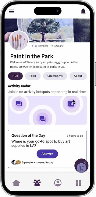
What makes this dashboard different from other social media?

Instead of being dropped in a busy feed with random faces, you are greeted with the Community Hub.
A lively and welcoming space where in the forefront, there are conversation prompts and gentle ways to join within the community.
Many users shared that traditional social media feeds felt overwhelming, especially when first entering a community.
By making the Community Hub the starting point, the experience shifts: similar to entering a gathering, where you can choose your own pace of engagement.

Question of the Day
Offers a low-pressure way for everyone to contribute and engage right from the get-go.
Can answer community-member written or AI-generated questions
View and comment on others' answers
Activity Radar
Stimulates feeling of looking around and spotting where people are gathering.
Join active chatrooms
Answer polls
See recent posts
+ more

The impact of this was clear. As one participant put it...
"It feels inclusive and inviting."
Source: User test 3
The sense of belonging, being able to step into a space and immediately feel part of the community or have the potential to do so, was exactly what the Community Hub was designed to spark.
User test | Round 2 — Community Hub
-
Positive reception to Activity Hub
-
Enjoyed all different community avenues were in one place
-
Ability to see “the gist” of community
-
Good balance of levels of effort to interact & engage
-
-
Where we can improve
-
Didn’t notice Activity Hub can expand, but liked poll as conversation starter
-
First instinct was to see people in the community (hidden at the bottom)
-
Now that our community feels like a lively town square, the next step was sparking friendships between members.
Essentially, how can we foster meaningful connections where people feel comfortable interacting with one another to form a close-knit community?

Real-time conversations and shared interests drive connection
Our research showed that real-time interactions (like live chatting) help people feel more connected than posts or comments.
These two-way exchanges encourage real dialogue instead of one-sided monologues.
"Authenticity is possible in online spaces if people talk or communicate or share about themselves long enough, you will learn who they are."
Source: User interviews
At the center of it all are shared interests. From pop culture to hobbies, shared interests are the binding force that brings people together keep communities engaged.
"...making friends is tricky...There has to be a mutual interest in some way."
Source: User interviews
Small nudges grow into deeper one-on-one connections

Opt-In

Send a Wave

Send a Note

Start a Chat
These insights led to the creation of Bumping, a feature that mirrors the feeling of bumping into someone in a shared space.
We designed gentle nudges that would be embedded in the app to prompt interactions between members.
Refining the feature to feel natural and seamless
We created several iterations to this feature based on the feedback from user testing. At first, we wanted to test if users would be interested in a feature where the AI played a bigger role in helping members meet.
Once we saw interest, we refined the experience to feel less disruptive.

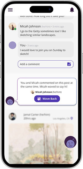
Instead of pop-up dialogues, bumps now appear below relevant posts, with one clear task inside the card.
Originally a pop-up notification, with two clickable options
Now embedded into the feed with a clear singular task

An onboarding flow was added to give members control over the bumps.
They can choose if they want to receive bumps and set their intent—whether that’s meeting new people, attending events, or finding mentors.
Explains Bumping feature to users and gives clear opportunity to allow degree of desired Bumping


Lastly, we redefined the AI's role. Rather than moderating and feeling invasive to users' interactions, the AI now quietly monitors for safety.
The original role of the AI was included in the chat conversation to assist in moderating interactions
It now monitors the chat for safety in the background
This feature brought the feed to life and support the way people naturally form new connections.
These small, actionable prompts made it easier for them to start conversations and feel closer to other members of the community.
Additional learnings
Mixed reception of gamification, often tied to a feeling of deception and disingenuous.
Transparency of AI features when in use was appreciated, encouraged confidence.
People enjoyed and had the most clarity in step-by-step guides/tutorials when going through onboarding processes
People disliked the sense of being interrupted (Bumping as a pop-up vs. not)
General Humma.AI participant sourcing was actively engaged, but required multi-verification of their location (e.g., Los Angeles).
Experienced issues (e.g. bots, fraudulent users, etc.) with sourcing participants when sign-ups was collected through a non-encrypted form (e.g., Google Form).
Where we started vs. where we landed
Throughout this project, there were many points where the team had to pivot and rescope our project focus.
Ultimately, we were able to build out a concept of the Humma app that peaked users' interest and effectively addressed our design goal of building a platform for meaningful online connections.
The ask
Expedited implementation of UI designs of app to dev team
Establish differentiator for social media platform
The outcome
Team vouched for strong, research-backed solutions that would support designs for user needs
Concept prototyped Bumping feature + detailed onboarding user flow
Final reflections
Being able to integrate participatory design into the research was very rewarding to me. It felt challenging at times to facilitate an environment for non-UXers to ideate on solutions and come up with designs, but the participants created some great designs and provided wonderful insights.
It was also great to have been able to partake in open discussions with users (outside of an interview environment) about online community spaces. I think this built great rapport between me and the participants, that made designing much more intuitive.
With my cognitive science background and experience with synthesizing secondary research, I was able to lead the team's literature review to familiarize ourselves with the problem space.
This was the largest scale of synthesis I had to tackle (24 sources and 10 research topics) but the literature review came together nicely. The team was able to pull key insights and facts from their source(s) which made shaping the overall narrative/key message of the literature review effective.
Designing a social media platform felt daunting at first because it is such a saturated space, but being able to connect with users made completing the through-line to research to design all the more rewarding. In our final testing of the app designs, it was a great feeling seeing how receptive and curious participants were about the Activity Radar and Bumping.
It was also a great learning experience with participant sourcing and running into roadblocks like fraudulent participants/bots. I now have better knowledge on how to handle this type of situation and how to hopefully prevent it in my future research.